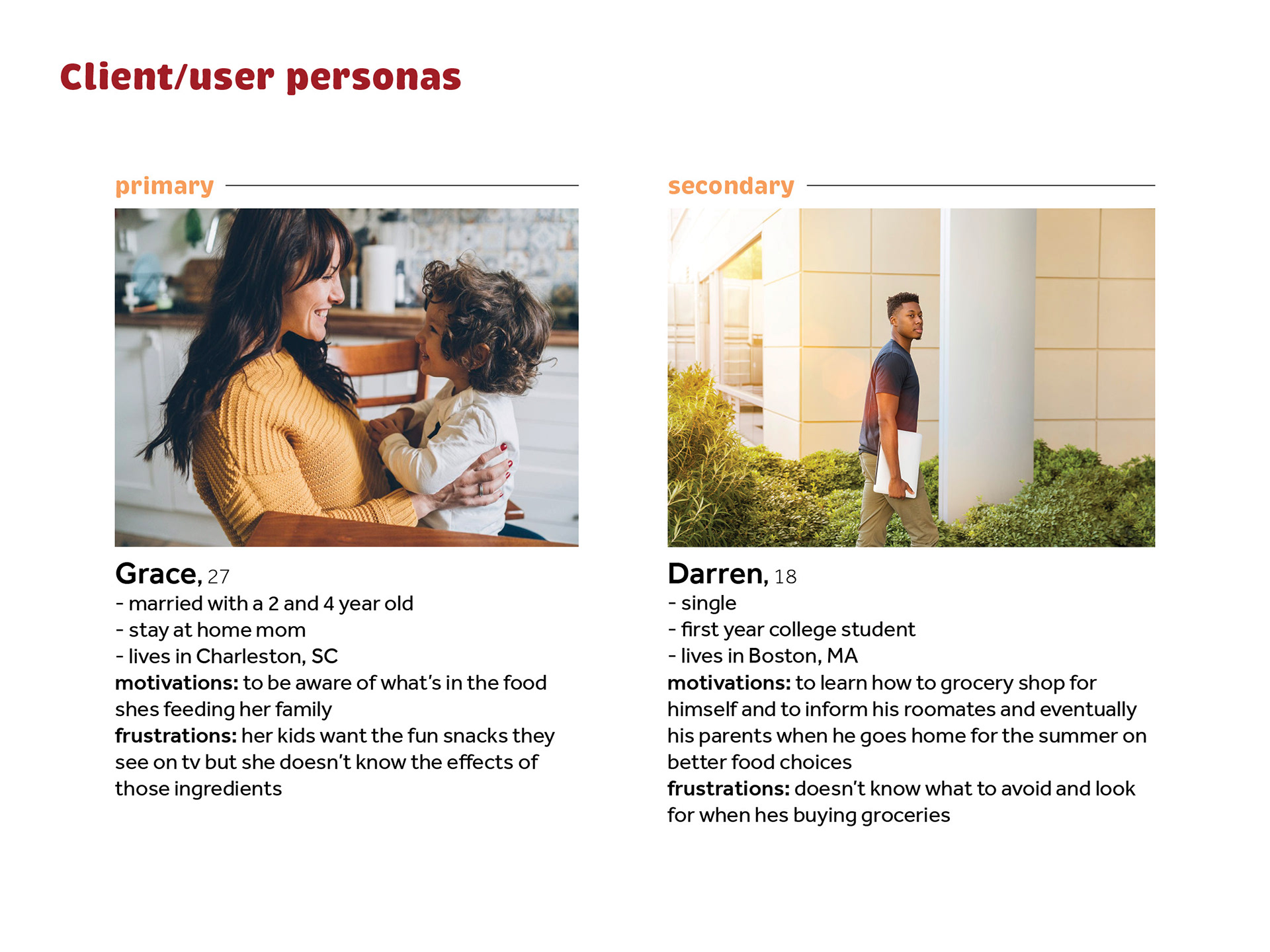
Presented with an opportunity to choose my own research topic relating to body and health, I landed on the topic of food in the USA. Specifically- what are the harmful preservatives and additives in America's food and what are the negative effects on the body? Each prototype is a different way to reach consumers and inform them on topics relating to U.S. food.
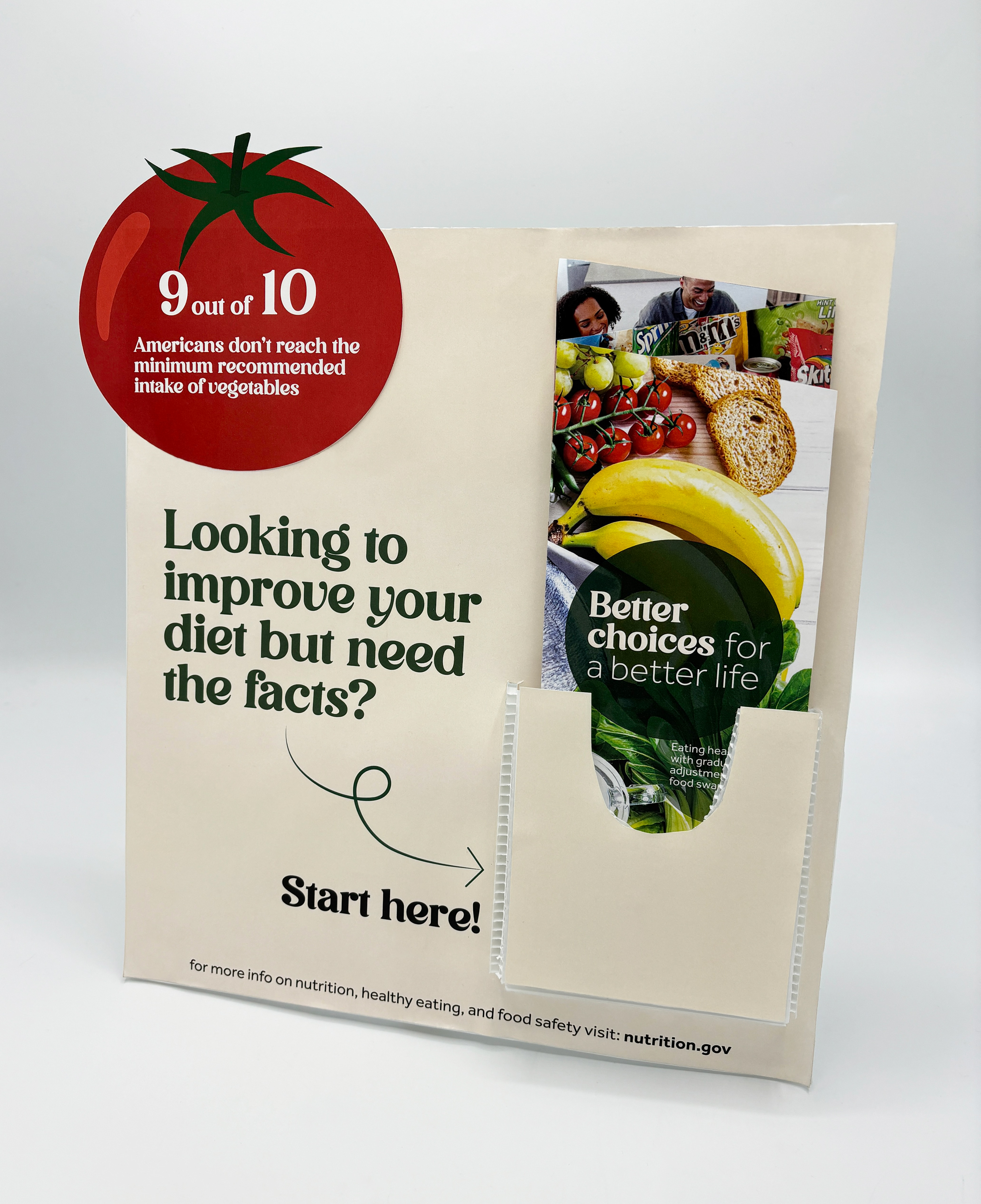
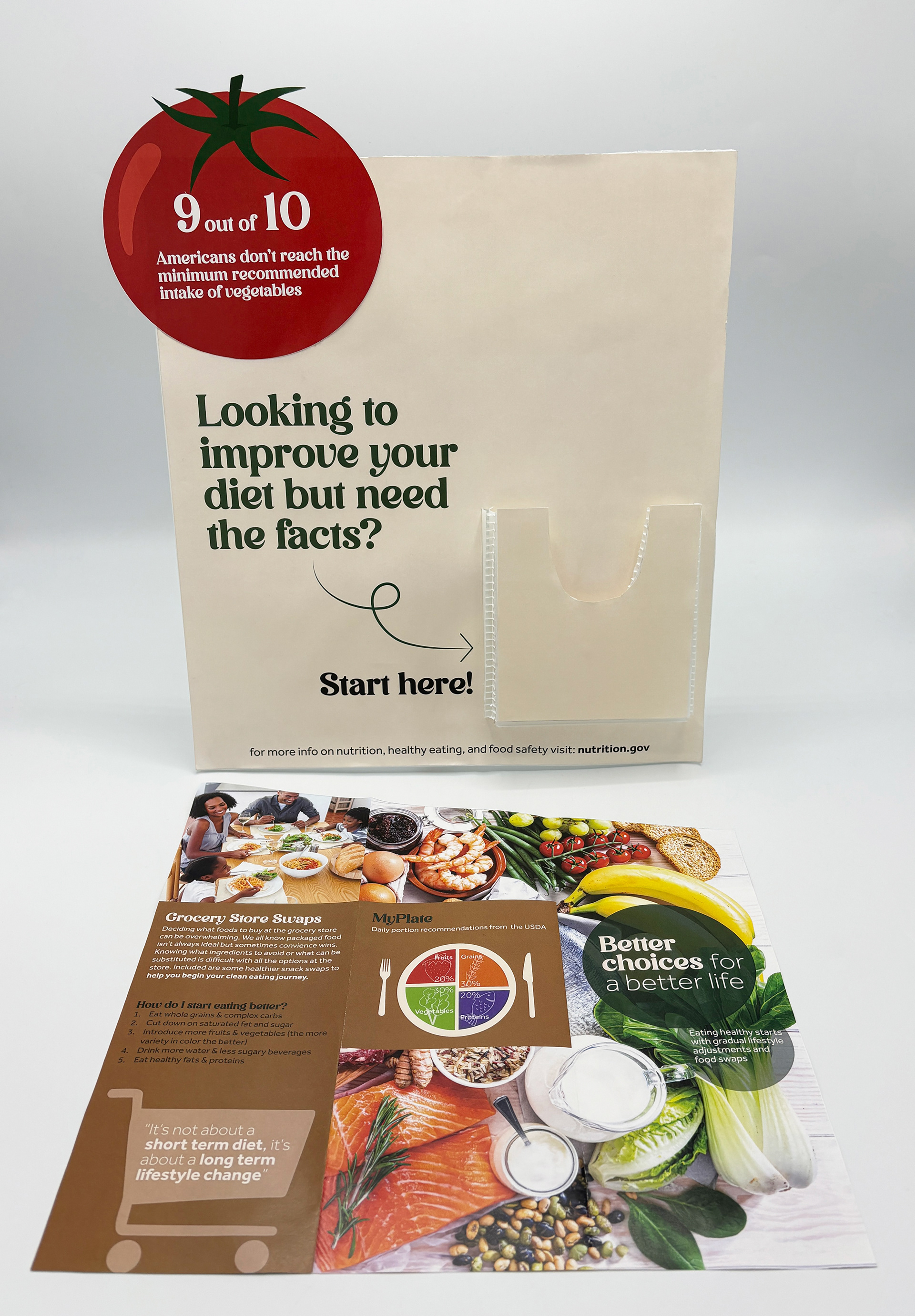
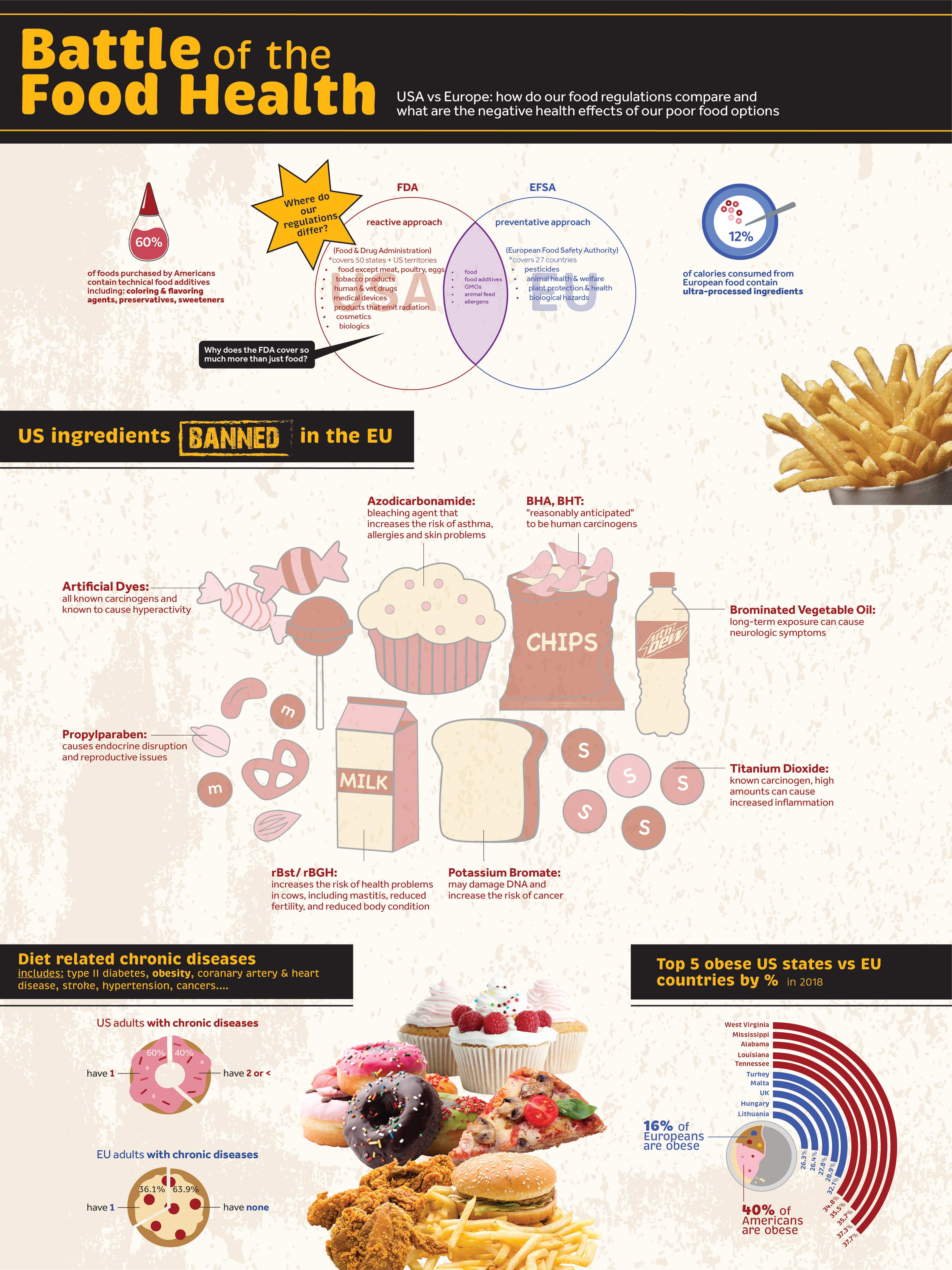
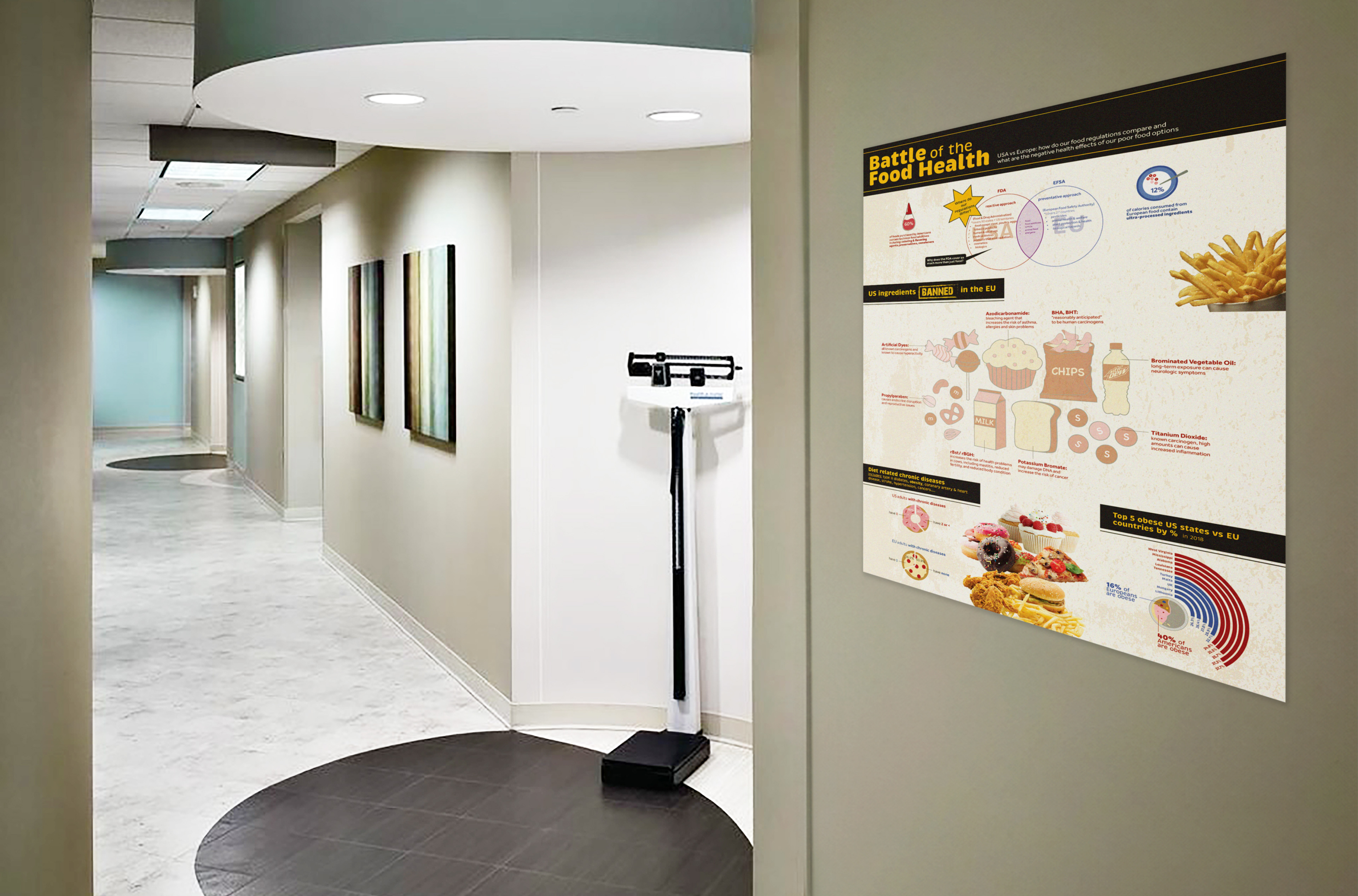
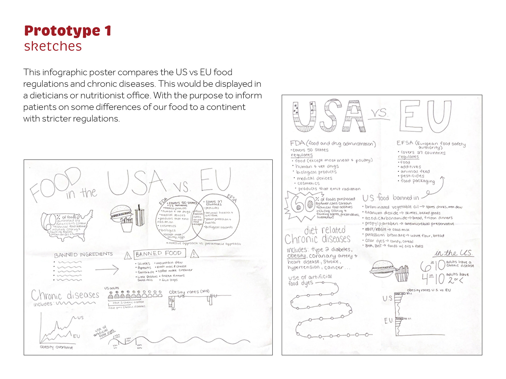
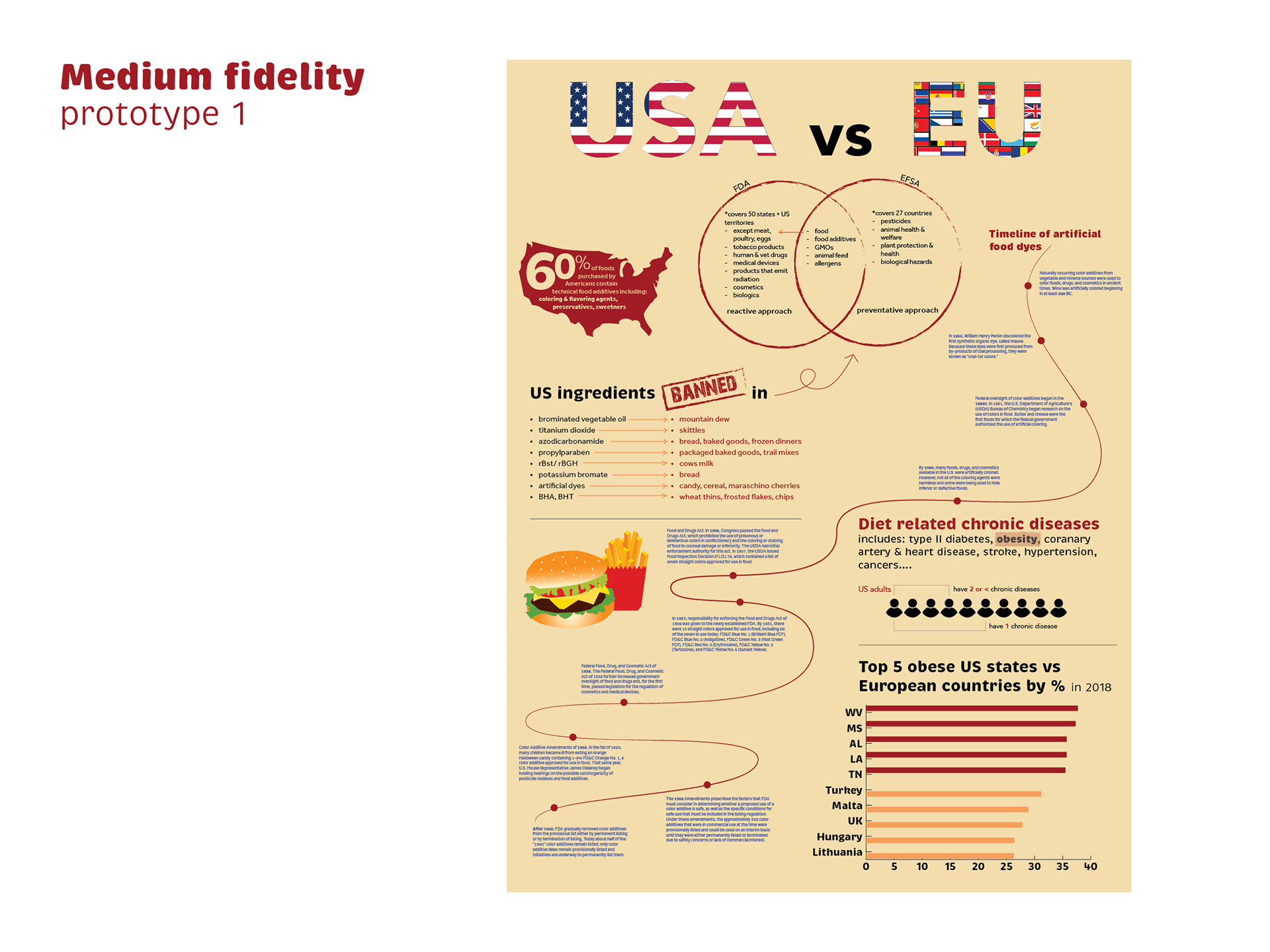
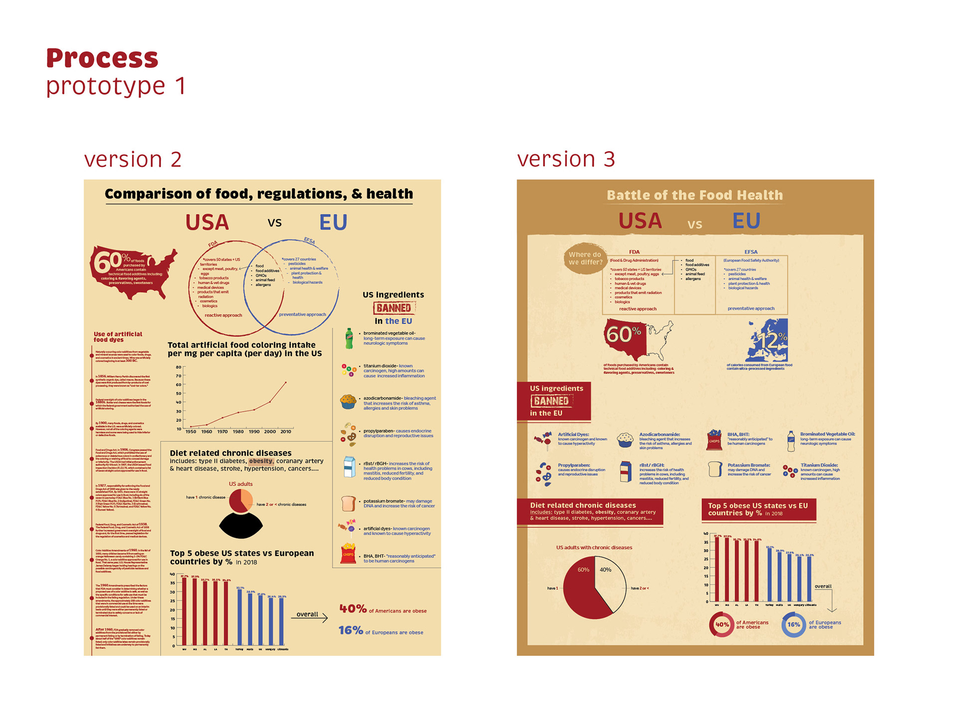
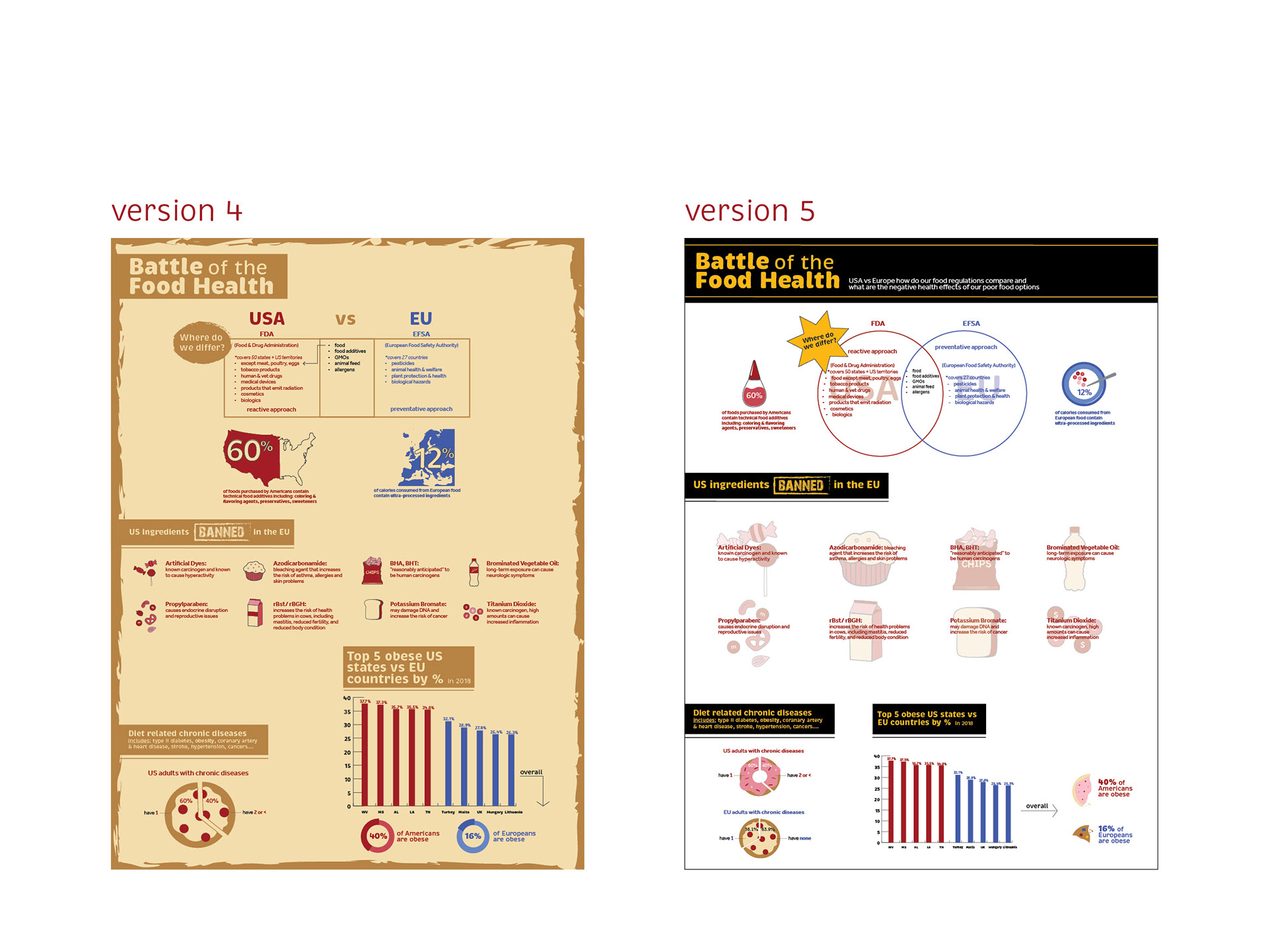
Prototype 1: poster (2024)
This poster would hang in a nutritionist/dietitians office.
This 18”x24” poster is titled “Battle of the Food Health” with a subtitle “USA vs Europe: how do our food regulations compare and what are the negative health effects of our poor food options.” The poster is broken into 4 categories- FDA vs EFSA, US ingredients banned in the EU, diet related chronic diseases, and top 5 obese US states vs EU countries by %. The color palette includes a bold yellow, black, red to represent the US, blue to represent the EU, and a grunge textured background. The first category is represented by a venn diagram comparing what the FDA covers (reactive) vs the EU (preventative). The second category includes vector art of 8 American foods that have EU banned ingredients in them and why they are toxic. The third category compares US vs EU how many adults have 0,1, or 2+ chronic diseases in pie chart form shaped like a doughnut and a pizza. The fourth category compares the top 5 states vs EU countries and their obesity rates. And the statistic that 16% of Europeans are obese compared to 40% of Americans are obese. The overall poster also includes cut outs of junk food photography to visualize how unhealthy US food is.
This is a mockup photo of a doctor's office that shows how this poster would appear on the wall.
This page is titled “Prototype 1 sketches” and includes 2 detailed poster sketches (vertical and horizontal) to show my process.
This page is titled “Associative word list” and includes 10 main words that each have 9 associated words to them. The main words are- quality, pathogen, GMO, FDA, nutrition, artificial, clean eating, chronic diseases, mental health, and preservatives.
This page is titled “Image studies” and includes 8 colorful images and illustrations that show 2 opposing sides to US food- overprocessed unhealthy food vs organic fresh produce.
This page is titled “Client/user personas” and includes 2 people who want to be more informed when grocery shopping. First is Grace (27, mom of 2) who wants to provide the best foods for her kids. Next is Darren (18, college student) who is learning to grocery shop for himself for the first time and wants to start better food habits. These 2 examples show how different but similar we can be but at different life stages.
This page is titled “Medium fidelity prototype 1” and shows the first version of the poster.
This page is titled “Process prototype 2” and shows version 2 and 3 of the poster.
This page includes version 4 and 5 of the poster.
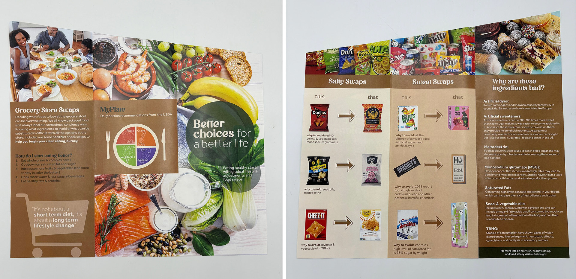
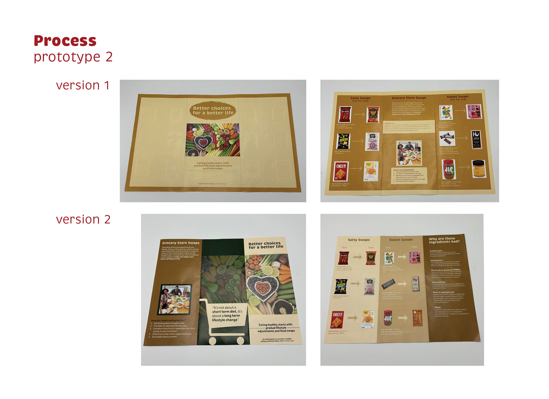
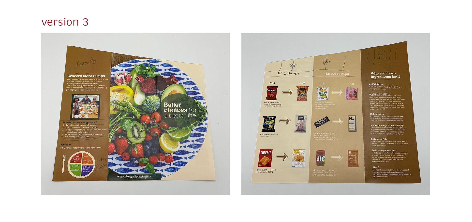
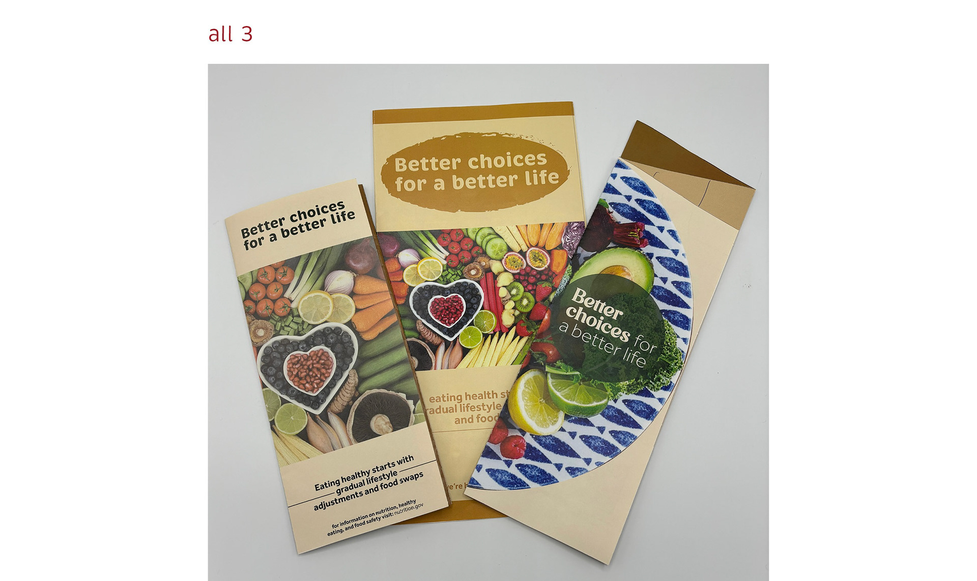
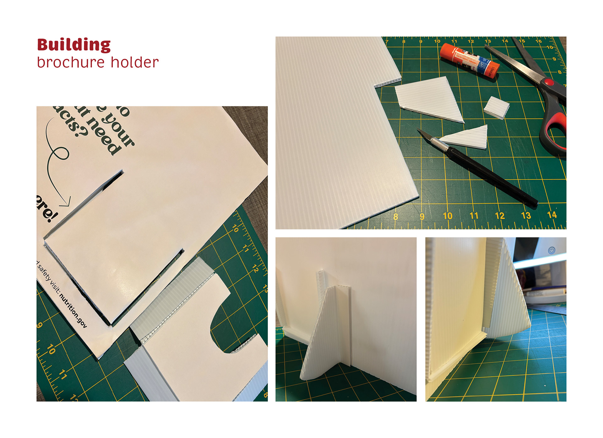
Prototype 2: brochure (2024)
These brochures would sit in a nutritionist/dietitians office as a handout for patients to get informed and start making lifestyle changes.
This image is of a handbuilt brochure holder and the brochure. The holder is mostly a neutral color but includes a tomato on the top left that reads “9 out of 10 Americans don't reach the minimum recommended intake of vegetables.” Then in the center it reads “looking to improve your diet but need the facts? Start here!” The brochure is titled “better choices for a better life.”
This image includes a front facing view of the brochure holder plus the brochure laying flat in front of it.
This image includes both a front and back flat view of the brochure. Elements throughout the outside include colorful photography of produce, a family eating together, a myplate diagram, 5 tips to start eating better, and a quote “it’s not about short term diet, it’s about a long term lifestyle change.” Elements throughout the inside include a salty swaps panel, sweet swaps panel, “why are these ingredients bad” panel, colorful photography of the packaging and marketing of American snacks.
This page is titled “Process prototype 2” and includes photos of 2 front and back versions of the printed brochures.
This page includes a front and back version 3 of the brochure.
This page includes a photo of all three rough versions folded next to each other for comparison.
This page is titled “Building brochure holder” and includes 4 process photos of me building the structure that became the brochure holder.
Back to Top