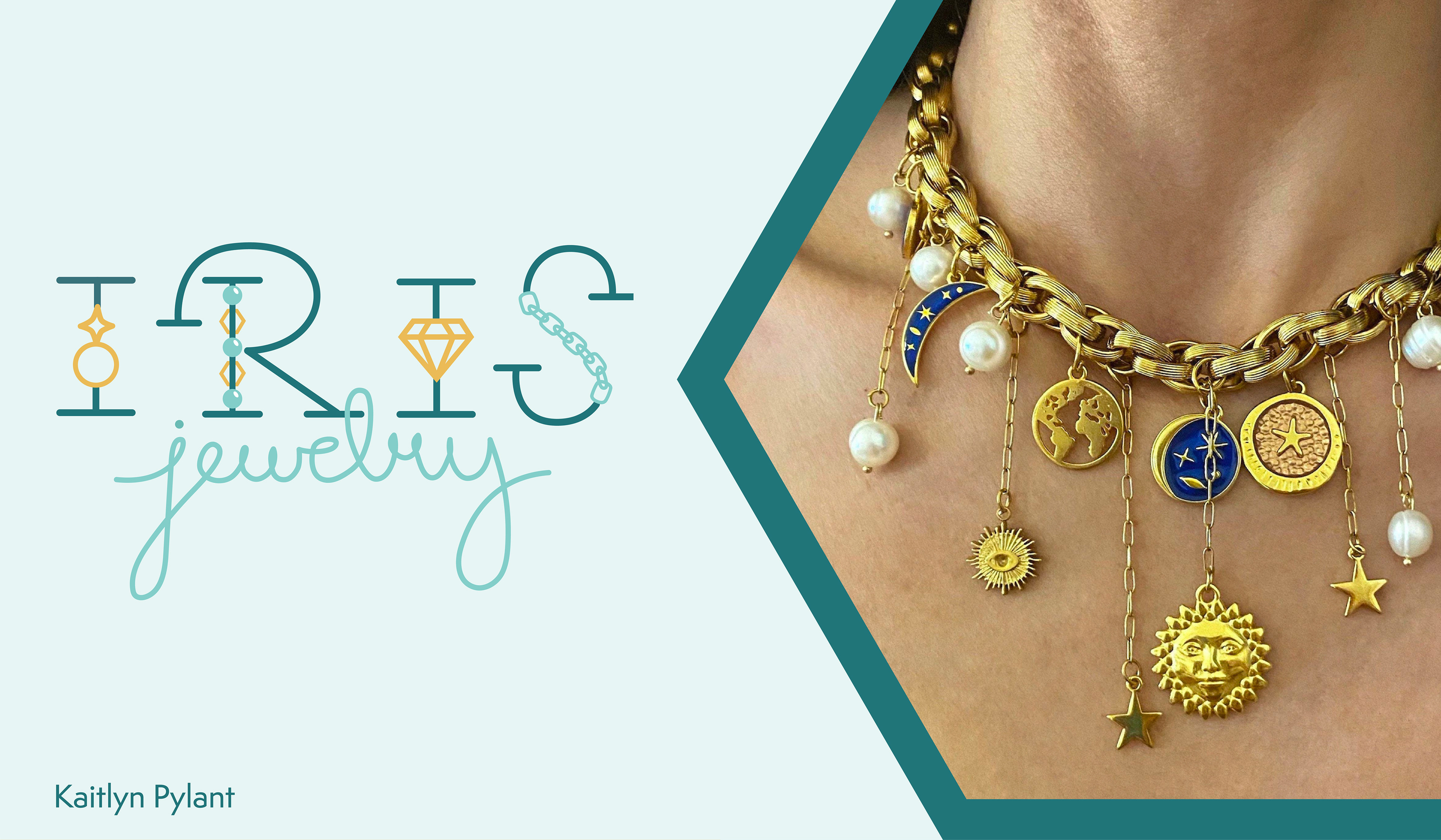
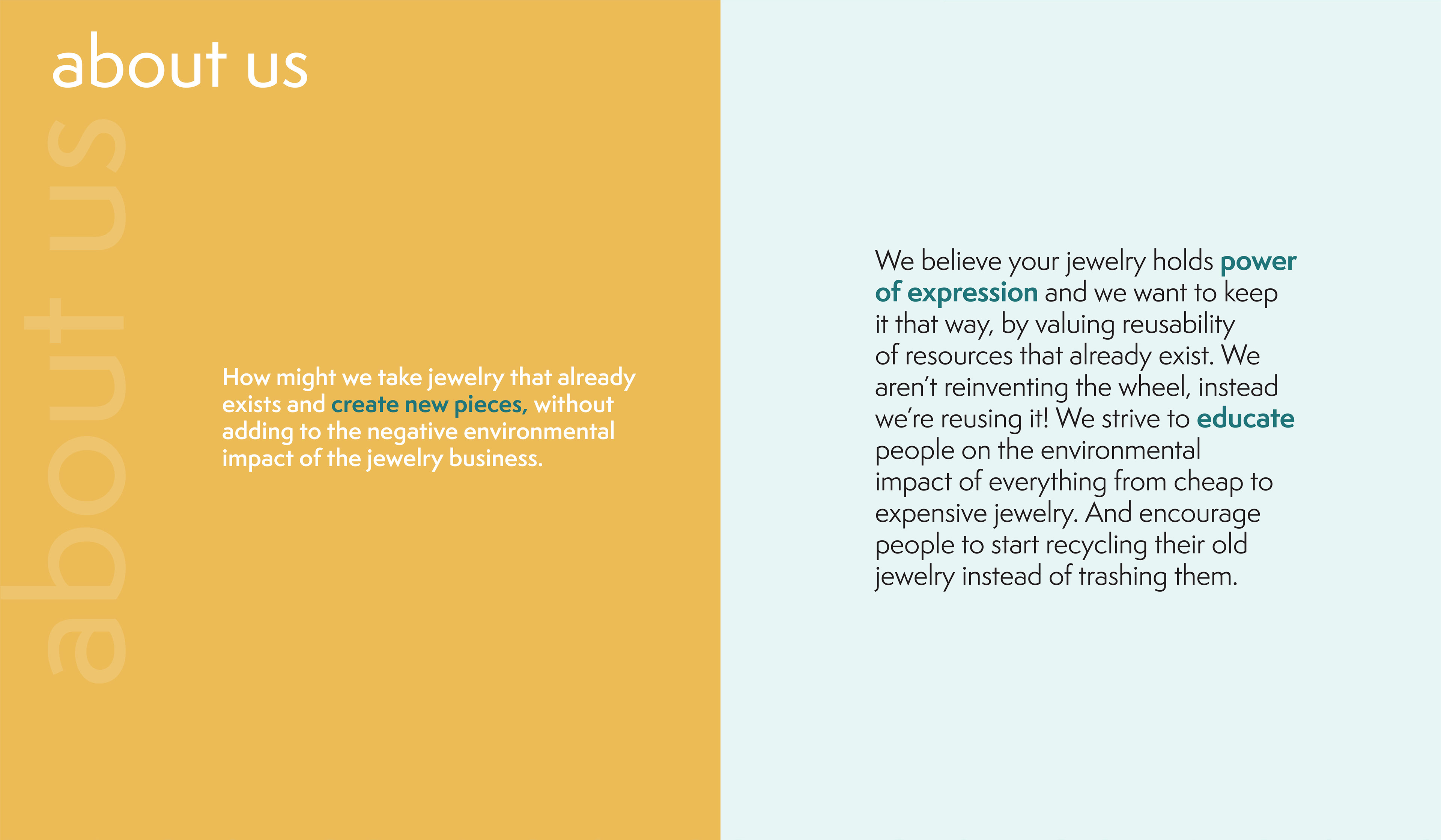
Iris Jewelry Brand (2023)
A sustainably conscious jewelry brand with a focus on adding some sparkle into up-cycled jewelry pieces.
Iris jewelry brand cover page including a photo insert of a woman wearing a chunky gold charm necklace.
Titled "about us" this statement reads "how might we take jewelry that already exists and create new pieces, without adding to the negative environmental impact of the jewelry business."
This page includes a statistic “it takes 20 tons of waste to produce a gold ring” (sustainablefootprint.org). Included is a vector visual of 20 sedan car outlines with the text “that’s about the equivalent weight of 20 standard sized sedans.”
This page includes a user persona example of a 24 year old female named Fallon who is a creative, adventurous magazine illustrator who has left the fast fashion lifestyle. She’s struggling to find ethically made jewelry that isn’t too expensive and to find something to do with all her old jewelry pieces.
Titled “logo development” this page shows an image trace of 21 logo sketches I made before deciding on the final logo.
This page includes 3 logo options that were chosen to turn into vectors and the final colored logo on the right. The final logo is turquoise, teal, and gold and includes jewelry elements in the letterforms of IRIS.
Titled “pattern development” this page includes 6 patterns made of both detailed and vague jewelry shapes like diamonds and chains. On the bottom the final pattern is shown in black and white and color and includes chains, beads, and jewels.
Titled “brand standards guide” this page includes the Iris logo in different colors, the brand’s 3 colors, logo do’s and don’ts, and the brand’s 2 fonts.
Titled “brand in use” this page includes a stationary mockup (business card, letterhead, and envelope) and a packaging label mockup. And a printed package design in a dodecagon shape with jewelry imagery on the top, gold and turquoise accents, a hexagon shaped thank you card, and text “our goal is to create new and unique jewelry pieces without contributing to toxic waste, deforestation, or erosion” on the bottom.
This page includes mockups of a magazine ad and a poster that read “jewelry from existing materials” and has a side profile of a woman photoshopped wearing a large bold dangly earring. Also is a mockup of the shipping bag and card included that would be sent to customers who will then fill the bag with old jewelry and send it back. It reads “fill up send back” on the front with the brand's pattern and colors.
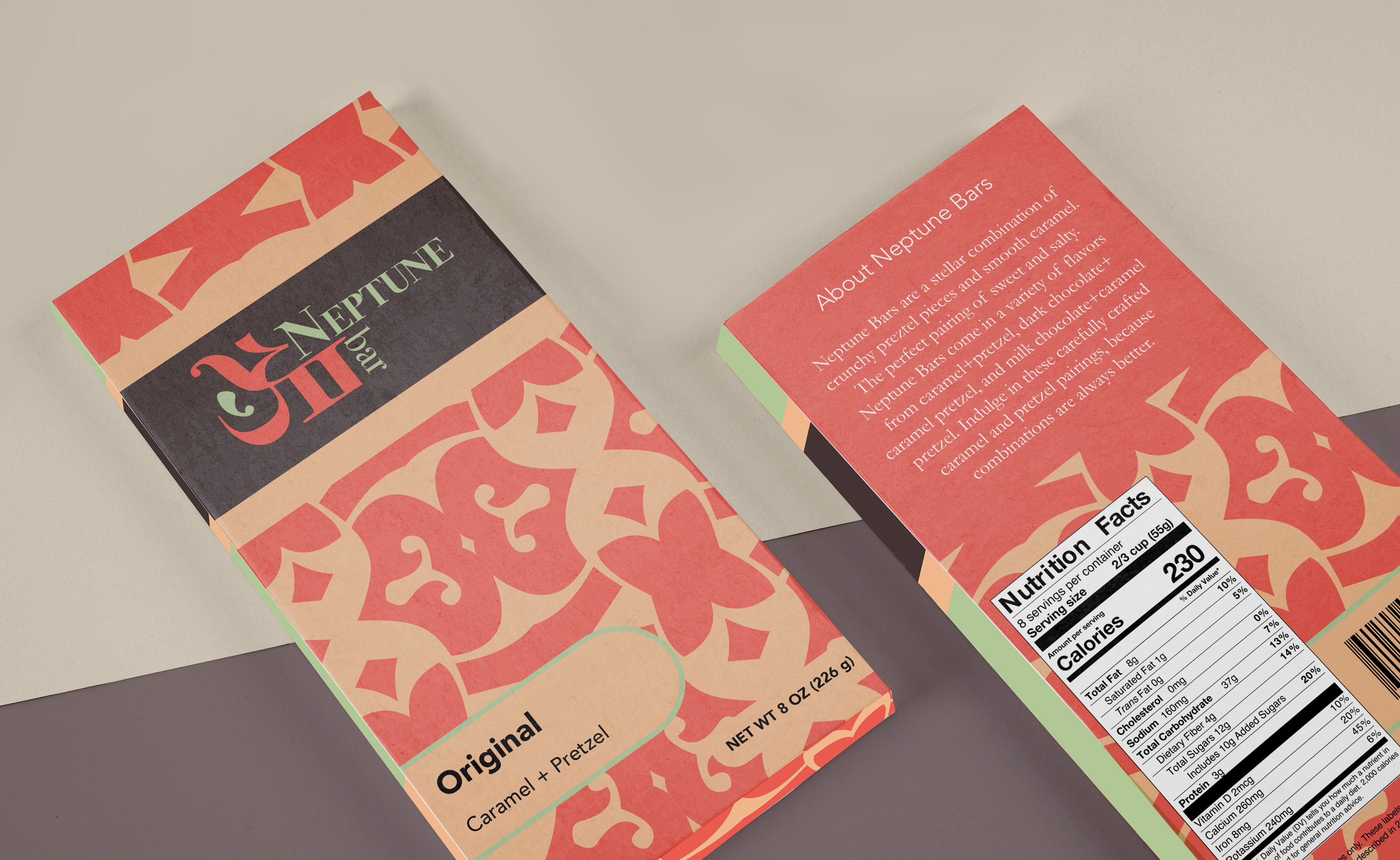
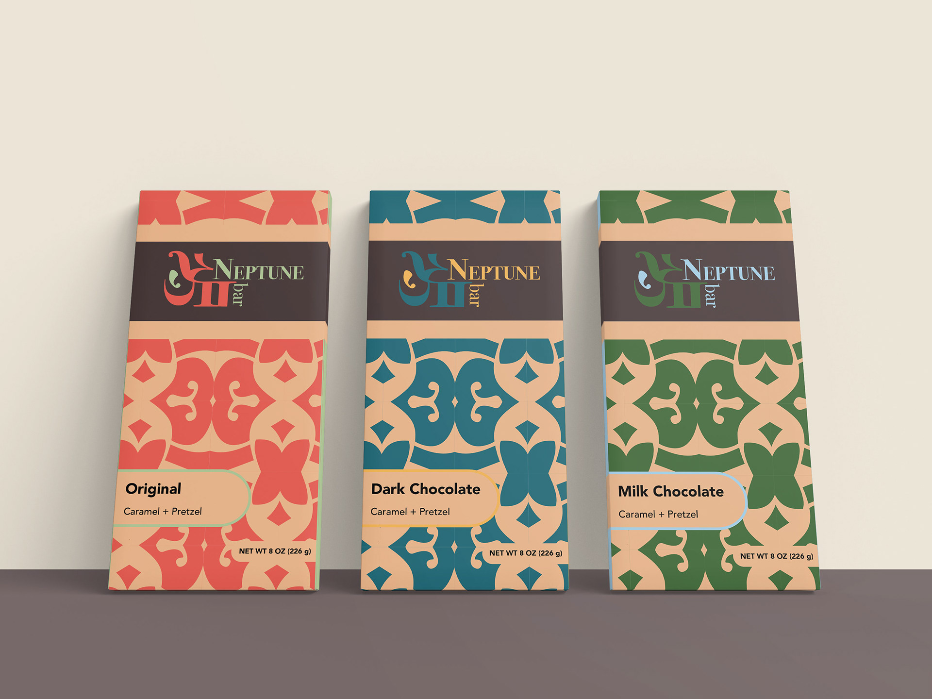
Neptune Chocolate Bar Series (2022)
On a planet far away from Mars Bars these chocolate bars will catch your eye in the sky.
This is a mockup photo of a candy bar called “Neptune bar.” It includes a coral, light green, tan, and brown color palette and has a pattern made out of serif letters broken apart and rotated.
This is a mockup photo of 3 different flavors of Neptune bars- original (coral and light green theme), dark chocolate (turquoise and gold theme), and milk chocolate (moss green and baby blue theme).
Back to Top